America’s counties are less purple than they used to be
- Written by Robert J. Vanderbei, Professor of Operations Research and Financial Engineering, Princeton University
 Looking at county election results shows the geography of America's partisan divide.Robert Vanderbei
The United States isn’t mostly red or mostly blue. It’s mostly purple. That’s what I’ve learned from a quarter-century of making maps based on the results of presidential elections.
The country is, however, becoming more split along party lines.
This work started as a curiosity project. Back in 2000, most maps of election results showed states colored either red or blue depending on which side had more votes in that state – Republican George W. Bush or Democrat Al Gore. But that one-or-the-other approach didn’t match up with an election that was so close, it was ultimately decided by 537 votes in Florida.
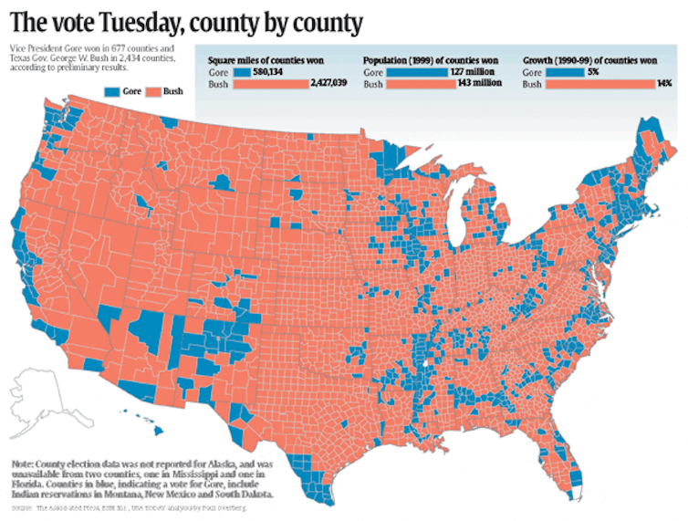
Shortly after the election in November 2000, the USA Today newspaper published a county-by-county map in which each county was colored red or blue, based on which candidate won that county.
 In 2000, an election map showed counties colored based on who they voted for in the presidential election.USA Today via ESRI
I live in Belle Mead, New Jersey, which is 8 miles north of Princeton, where I teach. I’m in Somerset County; Princeton is in Mercer County. Mercer County was blue in that election, but neighboring Somerset was red.
That inspired me to look at the actual data used for the map. In Somerset County, about 51% of the votes were for Bush and about 48% for Gore.
To me, that was disappointing: Why paint Somerset County red when it was almost a tie?
I wanted to write a computer program to make my own county-by-county map showing not just the winner, but the mix of voter preferences. At the time, I was teaching a course called “Computer Methods for Problem Solving.” I thought it could be an interesting final project for that class to have the students make a map that used shadings of red or blue based on vote totals for each party’s candidate.
My colleague Alain Kornhauser helped me get geographic data about each county in the country, so I could match them up with vote totals, which I have mostly gotten from data compiled by Dave Leip. I wrote my own code to create such a map, but I didn’t actually use that idea as the final project for the class that year. I was thinking I would use it as the final project the next year.
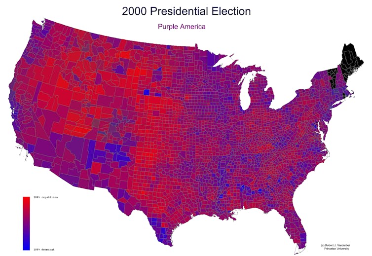
But I did put my “Purple America” map on my university webpage. And there it sat for four years, largely unnoticed.
 The original ‘Purple America’ map from 2000.Robert J. Vanderbei
A look through time
About four years later, someone discovered my Purple America webpage. When I looked at the traffic data, I found it had gone viral.
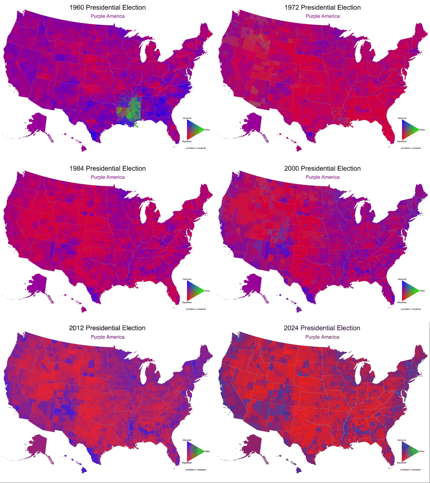
Ever since, after each presidential election, I’ve been making that year’s version of the map. I went back and did all the elections since 1960 as well. As I’ve written on my own website, these maps are still potentially misleading because a densely populated area like New York City takes up a small area, while a sparsely populated area like Montana takes up a lot of space. But they still show a clearer picture of a country that is not just red or blue.
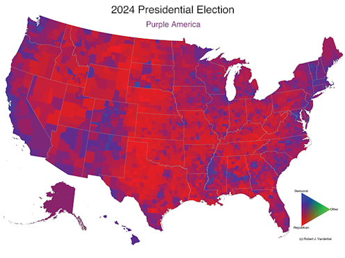
 America remains a purple country after the 2024 election, but less so than in past years.Robert Vanderbei
Over time, those maps have shown the U.S. becoming more geographically polarized. In 2024, most counties lean strongly toward either red or blue. Some are still purple, but there are fewer of them, and they’re less purple than they used to be.
Robert J. Vanderbei does not work for, consult, own shares in or receive funding from any company or organization that would benefit from this article, and has disclosed no relevant affiliations beyond their academic appointment.
Authors: Robert J. Vanderbei, Professor of Operations Research and Financial Engineering, Princeton University
Read more https://theconversation.com/americas-counties-are-less-purple-than-they-used-to-be-243543

